Design system
Every color, font, button, card, and pattern currently in use across the DayTimeOwl site — homepage, shop, our story, spice rack, wholesale, blog, and checkout — pulled from the actual token files and component CSS, not redrawn from memory. Last reviewed against the live site to remove fonts/colors that are no longer actually used anywhere.
Color
From tokens/colors.css. The purple scale is the page/surface background system; lime and orange are the two brand accents; cream is text and light surfaces.
Typography
Two system fonts carry the whole site; three self-hosted accent fonts (all Fontshare, ITF Free Font License) and two Google Fonts (Love Light, Rozha One — both OFL) are used sparingly for specific headlines and flourishes. Cabinet Grotesk, Boska, and League Script Number One were part of earlier iterations and are no longer applied anywhere live.
Buttons
All buttons hover to brand orange, regardless of their resting color — the one consistent interaction rule across the whole site. The Cart button's specular cursor-tracking shine effect (built earlier, via cart-shine.js) was removed site-wide — buttons are plain now, no hover glow beyond the color change.
Product card
Used on the homepage products grid and the shop page's Chai section — photo, title, origin, ingredient tags, price, Add button.
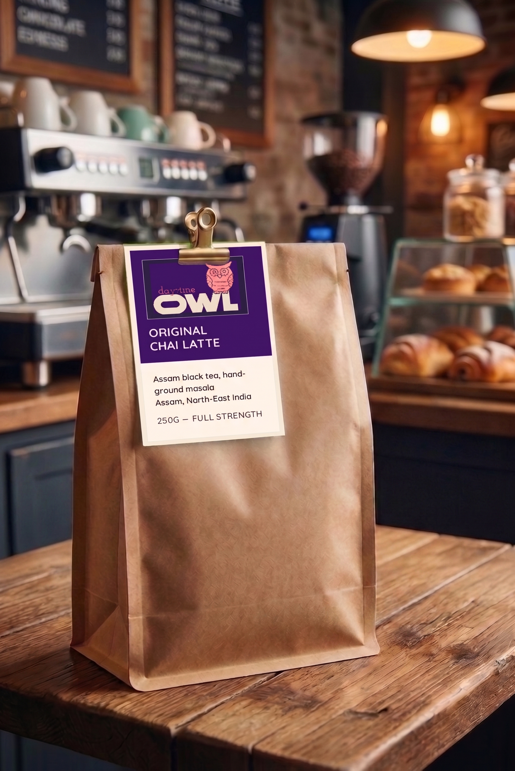
Glassmorphism
From tokens/glass.css. Three tiers — .glass-light (background level, high blur), .glass (primary panels), .glass-heavy (nav, elevated) — always placed over a photo or gradient orb so the blur has something to distort.
Full-bleed photo + glass CTA
The Wholesale page's pattern: a full-viewport photo slideshow (crossfades every 10s), a hover-to-reveal nav that stays off-screen until the cursor nears the top, and one centered glass card with a lime button that opens a floating glass enquiry form. No page scroll, no footer — the whole thing is one screen. The enquiry form now submits real leads via Formspree.
Do you own a cafe or run a business which consumes a lot of chai?
Hover-expand filmstrip
Ported from a Framer Motion component (Skiper 52 HoverExpand_001) to plain CSS width transitions. Used for the homepage Stat Badge blends and the Spice Rack carousel — click/hover a narrow panel and it widens, others narrow back down. The Stat Badge version also adds a click-triggered blurred description reveal, sliding in from the trailing edge of the panel, plus a "Click to explore" hint on hover.
Founder story scroll panels
Homepage "Where it all started" section: a horizontal-scroll filmstrip pinned for 3 viewport-heights, one solid-color panel per beat (see founder-purple/lime/orange/coral above) instead of a glass card. Each panel's text sweeps in and out at its own speed, independent of the background's scroll-linked translateX — the last panel gets an explicit hold so it stays on screen longer before handing off.
Cart & checkout
cart.js is the shared cart store (localStorage-backed) loaded on every page; cart-drawer.js injects the slide-in drawer and wires every .cart-btn to open it. checkout.html reads from the same store and shows a device-aware payment picker — Card and PayPal always shown, Apple Pay only where window.ApplePaySession exists (Safari), Google Pay only where the Payment Request API exists and Apple Pay doesn't (Chromium). Checkout currently completes with a mock flow pending a real Stripe/PayPal integration.
Blog post article
Shared template for all real posts (blog-post-*.html): a sticky, full-bleed hero photo the article body scrolls up and over — the body needs its own opaque background and a higher z-index than the hero, or it silently paints underneath it. Nav/heading pinning across the site depends on no ancestor having overflow: hidden; several pages had that bug from decorative glass-orb clipping and needed the orbs moved into their own absolutely-positioned clipping layer instead.
Category row
From the shop page — one category per row, a lime "shop now" pill for what's live, a muted outline pill for what's launching soon.
Radius & shadow
From tokens/effects.css.